i started this on my laptop a week ago, but it's taken me THIS LONG to feel better about it. i have a really hard time drawing people, and lately i've been trying to get over being afraid of it hahahaha. i put my art history lecture time to good use.
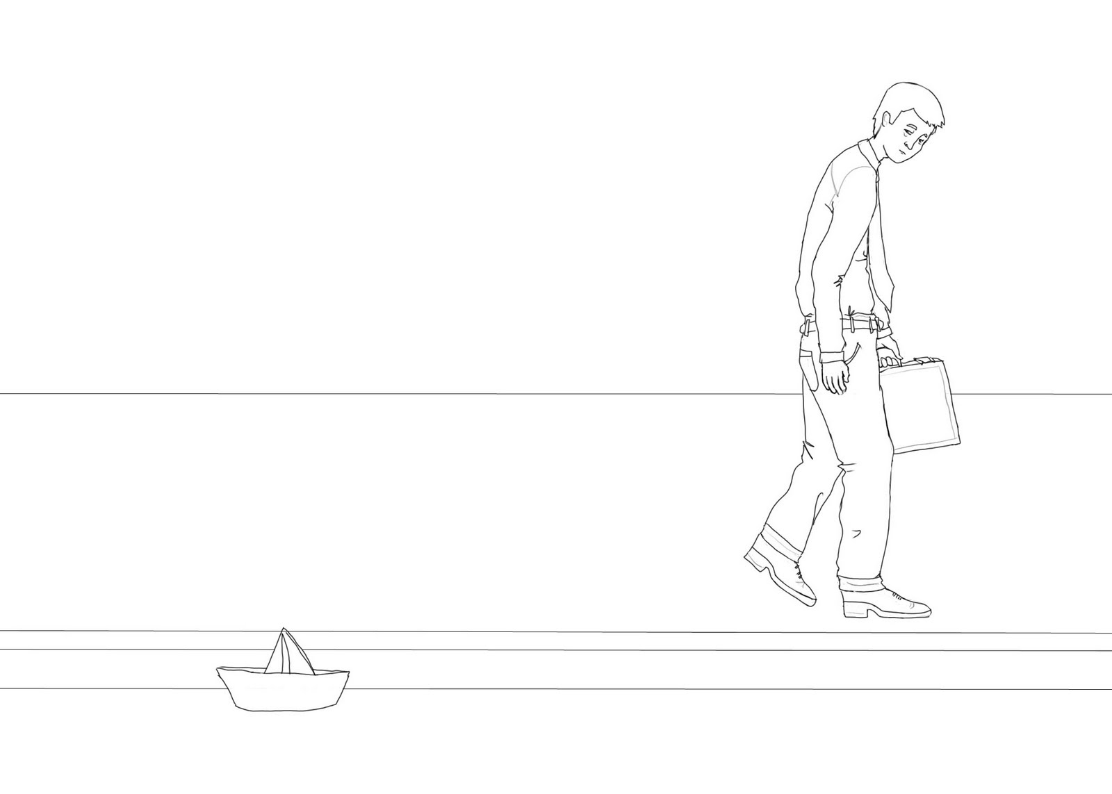
this guy looks sort of awkward...but i'm not sure how i could fix it. all criticisms welcome.
i'm also worried about how i'm going to color it. so many possibilities...but i guess anything's better than nothing. i wish i could do this:
 isn't it beautiful?? looks so natural...the animation in the trailer is ridiculously good, too.
the movie comes out on thanksgiving, by the way. i had serious doubts about it, but it looks like disney animation gave a big push out of desperation. kudos. and the upcoming pooh movie looks beautiful. although i'm afraid for the future................the guy who was in charge of disney channel aka turning it into a money machine via hannah montana and the jonas brothers stuff is now the director or something of disney animation.
Daaaamn. I have a lot of issues with the Disney company as a whole. They have made some beautiful movies, but they are sort of an evil empire.
ReplyDeleteAs for your W.I.P., I think it looks a little funny because the man's head is a tad too small and he's not in balance. Hmm... I don't know. Something's a little wonky anyways.
Oh but also meant to say that wow, those lines are fine. Dang. I like the way that makes it look.
ReplyDeletethanks for the feedback...yea my roommates and friends have said that his head a little small, and his hands...and his arm is way awkward.
ReplyDeleteback to it, i suppose lol. maybe i'm trying to be too realistic...bc that's not the point. hm.
I mean don't sweat it too much, because in a way awkwardness can give it character, too.
ReplyDelete